… and imagine the same thing happening all across the United States of America ~
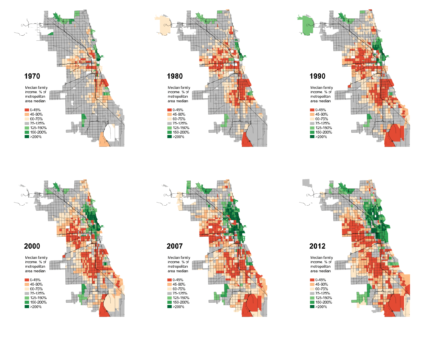
Watch as the grey squares, which illustrate the middle class that dominated the most of the city’s neighborhoods in 1970s, quickly vanish over 40 years.
The poor, represented by the orange and red colors, explode across the map.
And watch what happens in the green areas representing the upper middle class and wealthy. Not surprisingly, it spreads from downtown to the north side, but not with the same ferocity as the reds and oranges.
(The data comes from the U.S. Census.)Source: CBS Chicago
Unfortunately, this is the “fundamental transformation” Obama was talking about; “disappearing” the middle class.


Pingback: Big Government + Big Labor = Big Fail | Designs on the Truth